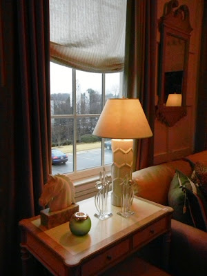
The hip younger sister. Shall we contrast Elizabeth Bennet to the elder Jane? That is how Max & Company feels while comparing it to Phoebe Howard's other shop, the more classically designed Mrs. Howard (see January's blog). The freshness of this showroom is felt before even stepping foot onto the gorgeous hardwoods; the soft colors of the octagonal entry space can be spied from outside the glass doors. And the other details? Cleaner lines. Simplified moldings. Gorgeous coffee table books. Softer hues. White metals. Casual stones. Industrial lighting. Bold artwork. Yet those perfect pillows (with chop) are still abundant.
Some of my favorites (part I):
 |
| Breathtaking 'riverstone' mosaics. |
 |
| Elegance of the perfect settee at the foot of the bed. |
 |
| The artworks speaks so perfectly to the exposed beam ceiling. |
 |
| If the space allows, love the nightstand doubling as a desk. |
 |
| Love the little brass crab for a beach house! |
 |
| Oh, so Ralph Lauren, but with a lightness. |
 |
| Gorgeous lamps and side chairs in the stairway. |
 |
| Did you notice the paneling and dental crown? Details galore! |
 |
| Wonderful custom lamps and accessories. |


No comments:
Post a Comment